The Last Slider You'll Ever Need: Swiper JS
31 May 2021
1 minute read
I have seen my fair share of sliders and methods to show images or text or a combo in some gallery format. Simple ones that just involve HTML, CSS, and some JavaScript to more complex ones that make you want to pull your eye lashes out because of how taxing they are to use for someone who's never used them. Well that all ended when I discoverd what is argueably and I will argue this, the best fucking slider library I have ever used. I've used it to much it has found it's way into nearly every project I've build in the last several years. The library is called Swiper JS.
The Last Slider You'll Ever Need
Swiper is the most modern free mobile touch slider with hardware accelerated transitions and amazing native behavior. It is intended to be used in mobile websites, mobile web apps, and mobile native/hybrid apps. Swiper is not compatible with all platforms, it is a modern touch slider which is focused only on modern apps/platforms to bring the best experience and simplicity. Many of my colleagues will say I am a fan of simple, easy to use code. I try to abide by a simple coding principle: could day one developer Marsel read and understand this.
I try to abide by a simple coding principle: could day one developer Marsel read and understand this.
I'd like to illustrate just how easy the swiper js library is to use and for that I will be showing some examples of past ones I have built as well, as linking you to their demo page which I found very useful. The demo page is filled with countless examples of ways your might employe the swiper js library. Of course you will also need to set up some configuration for using the swiper and for that a reading of their API and documenation is required. I must remark that their documenation is some of the best I've seen written.
Adding the stylesheets and script src is fairly simple and mostly the method I usually use to create a swiper. Naturally styles go in the head and scripts just at the end of the body tag.
				<link rel="stylesheet" href="https://unpkg.com/swiper/swiper-bundle.css"/>
				<link rel="stylesheet" href="https://unpkg.com/swiper/swiper-bundle.min.css"/>
				<script src="https://unpkg.com/swiper/swiper-bundle.js"/>
				<script src="https://unpkg.com/swiper/swiper-bundle.min.js"/>
You'll also need to structure the swiper by adding the container, wrapper, the slides themselves, pagination if you want it, and navigation buttons if you want them also. Note that pagination and buttons go inside the main contianer. You can adjust this if you need and I have had some designs that required this but for the basics this will satisfy.
				<!-- Slider main container -->
				<div class="swiper-container">

					<!-- Additional required wrapper -->
					<div class="swiper-wrapper">

						<!-- Slides -->
						<div class="swiper-slide"> Content of Slide 1 </div>
						<div class="swiper-slide"> Content of Slide 2 </div>
						<div class="swiper-slide"> Content of Slide 3 </div>

					</div>

					<!-- If we need pagination -->
					<div class="swiper-pagination"><>

					<!-- If we need navigation buttons -->
					<div class="swiper-button-prev"><>
					<div class="swiper-button-next"><>

				</div>
The last step is to initialize the swiper. Now this is where reading the documenation is vital, especially for more robust swipers and super fancy ones. There are two lessons I want to impart here that I learned the hard way. Where it says below new Swiper and lists the class of swiper, you can add other classes here. I always give swipers individual names for two reasons. One, this container can only work with one Swiper, same with the navigation buttons. The second is you can't have two swipers on the same page with the same name because it confuses the javascript. I'll demonstrate in my example below.
				<script>
					const swiper = new Swiper('.swiper-container', {
						// Optional parameters
						direction: 'vertical',
						loop: true,

						// If we need pagination
						pagination: {
						el: '.swiper-pagination',
						},

						// Navigation arrows
						navigation: {
						nextEl: '.swiper-button-next',
						prevEl: '.swiper-button-prev',
						},

						// And if we need scrollbar
						scrollbar: {
						el: '.swiper-scrollbar',
						},
					});
				<script/>
These are some Swipers I've built over the years with links to their demos:
TVAR Solutions
In the TVAR Solutions build I employed swiper features that allow for fading transitions. Here we technically only see one slide at a time. The navigation buttons are stationed next to the team member's profile. This is a basic slider at it's most simple form and the first one I ever built. A lesson learned here was I should have read the documenation sooner and not hacked as much of the code!

Congressional Institute
The news slider component on the Congressional Institute homepage features a swiper that allows for navigation control and is responsive to media queries. This is something you can set in the initialization of the swiper.

NJI Media
For the NJI Media case studies I included custom navigation buttons, mouse wheel control, and mouse draggable. Media queries are also in play to show only two and a half at a time.
Example Swiper Full Functional
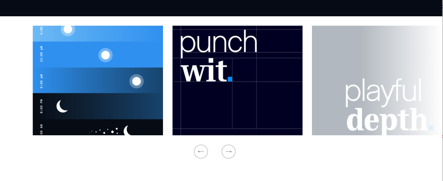
Now let's build an interactive slider together. This is the slider we will be building. It has autoplay for slides, mouse scroll enables, mouse drag capabilities, and custom navigation buttons. It also boosts media queries options.
This is what the raw structure looks like. Note the custom swiper controller class and the custom navigation classes.
				<div class="swiper-container article--swiper">
					<div class="swiper-wrapper">
					  <div class="swiper-slide article--swiper__slide"
					  	style="background-image: url('url here');"></div>
					  <div class="swiper-slide article--swiper__slide"
					  	style="background-image: url('url here');"></div>
					  <div class="swiper-slide article--swiper__slide"
					  	style="background-image: url('url here');"></div>
					  <div class="swiper-slide article--swiper__slide"
					  	style="background-image: url('url here');"></div>
					  <div class="swiper-slide article--swiper__slide"
					  	style="background-image: url('url here');"></div>
					</div>

					<div class="article--swiper__buttons">
						<div class="article--swiper__prev">PREV</div>
						<div class="article--swiper__next">NEXT</div>
					</div>
				</div>
The controller is a bit more unique that previously.
- Unqiue controller name of ".article--swiper"
- Loop is set to true that loops the slides endlessly
- Autoplay is enabled and delayed to 5 seconds
- You can scroll using mousewheel
- Media queries are set to 1 slide on mobile and 2 slides on iPad up with 20px of margin in between
- Navigation buttons must match to at least the main class
				<script>
					const swiper = new Swiper('.article--swiper', {
						// Optional parameters
						loop: true,
						autoplay: {
							delay: 5000,
						},
						mousewheel: {
							invert: true,
						},
						breakpoints: {
							320: {
							slidesPerView: 1,
							},
							760: {
							slidesPerView: 2,
							spaceBetween: 30
							},
						},
						// Navigation arrows
						navigation: {
							nextEl: '.article--swiper__next',
							prevEl: '.article--swiper__prev',
						},
					});
				<script/>
I've become a big fan of swiper js. I hope this little introduction helps you not only get started but also come to love the slider as much as I have.
Happy coding!