Case Study: Airlines for America
15 June 2021
1 minute read
The Airlines for America (A4A) is an association that advocates for the success of their member companies. Soaring to new heights, A4A, needed a revamp in both design, functionality, and message. The airlines industry were hit hard during the 2020 Covid Pandemic, and A4A advocated for their partners every step of the way. This bold new design was one way to advocate in a more modern, fresh look. Coding the website I took great time and immeasureable effort to craft a site that reflect this.
A4A's old website left much to be desired. Their look was outdated and frankly just boring. It reminded me of a website from the early 2010's with the look and functionality of something older. The backend was a nightmare of code that felt like a house of cards. There was so much bad code that clearly too many developers had worked on it.
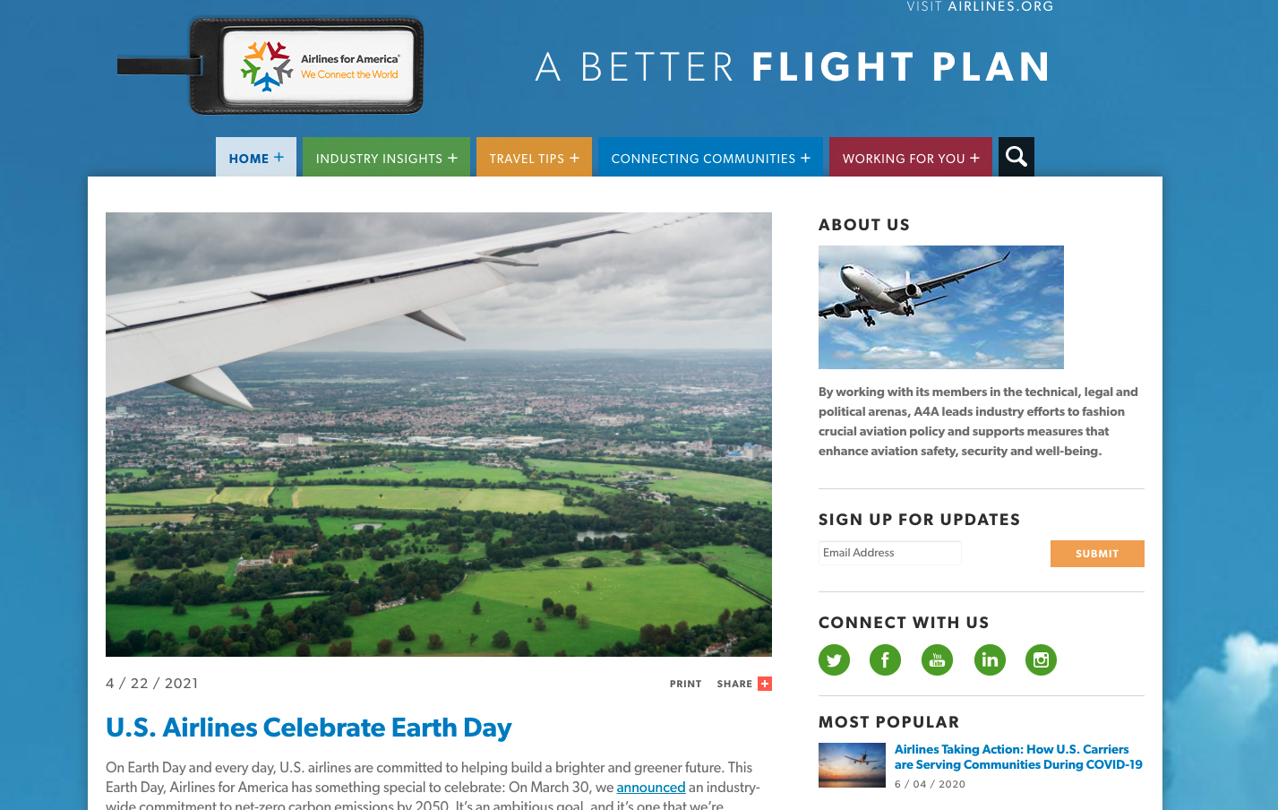
 The old homepage tab system was outdated.
The old homepage hero was a tab system and a slider. This redundancy felt meaningless with no real purpose of serving the user or client. A new homepage hero gave it a slick new look with a similar slider concept but no boring tabs at the bottom. Since leaving NJI Media, one thing I learned was that hero sliders are actually bad ideas. Analytics show that most users rarely click through all the slides, making hero sliders a poor choice.
Analytics show that most users rarely click through all the slides, making hero sliders a poor choice.
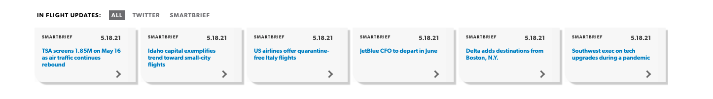
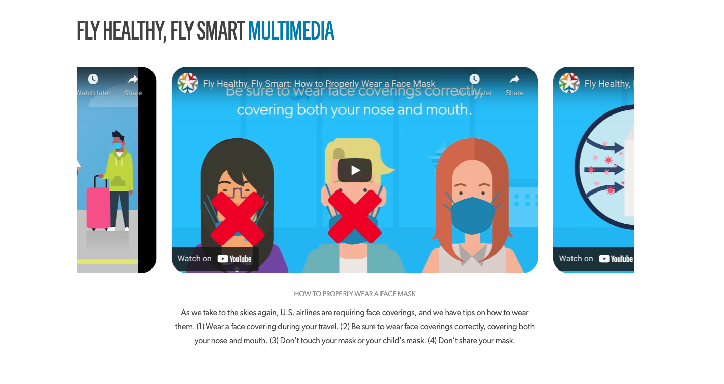
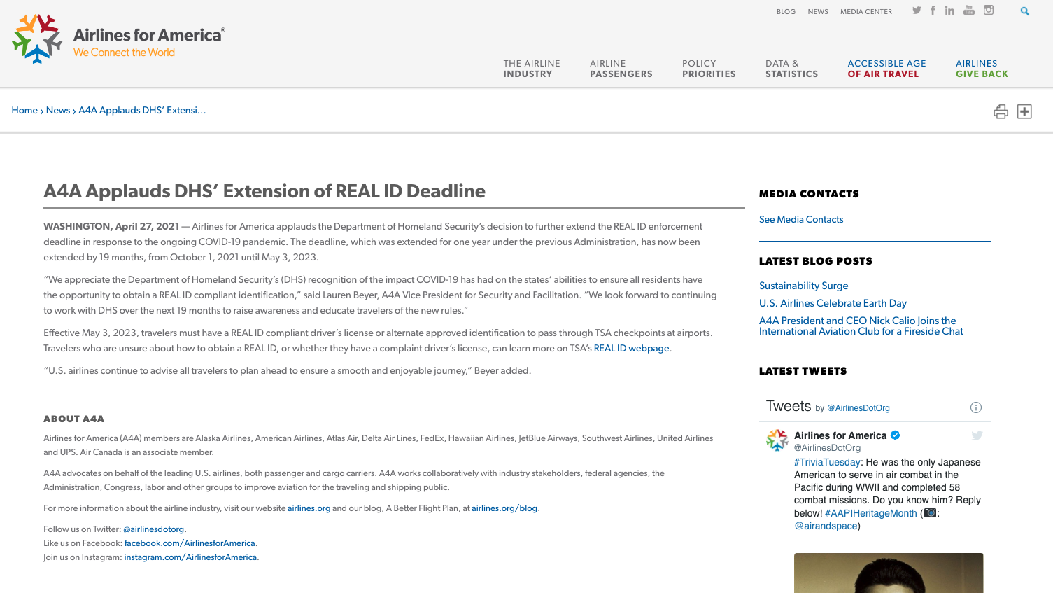 The old blog post example.
The individual blog posts needed attention also. Their stale and boring look left the user feeling unappreciated. This was the best a major lobbyist could do? The new look provided much diversity in terms of heros, category styles, sidebar options, and inner block styles.
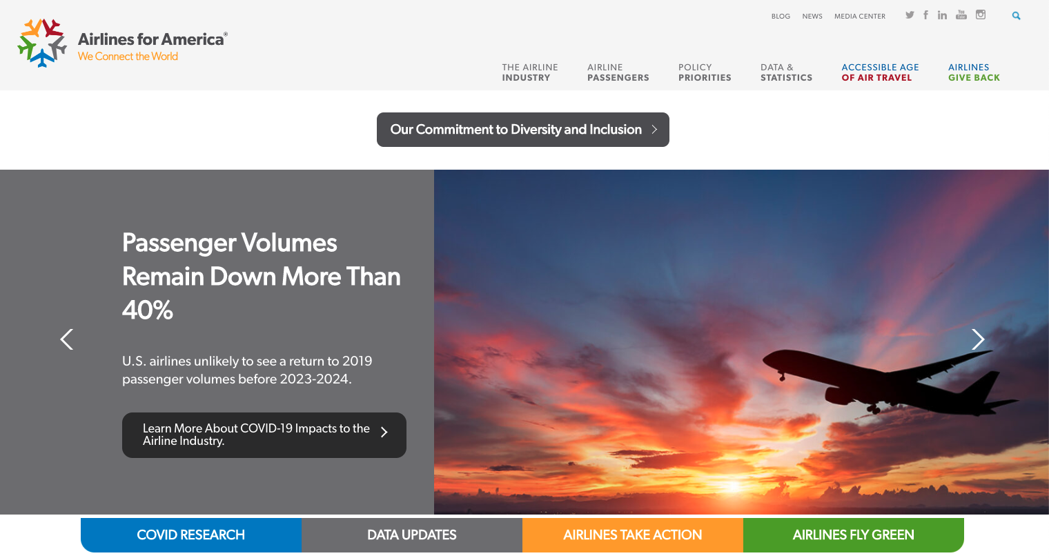
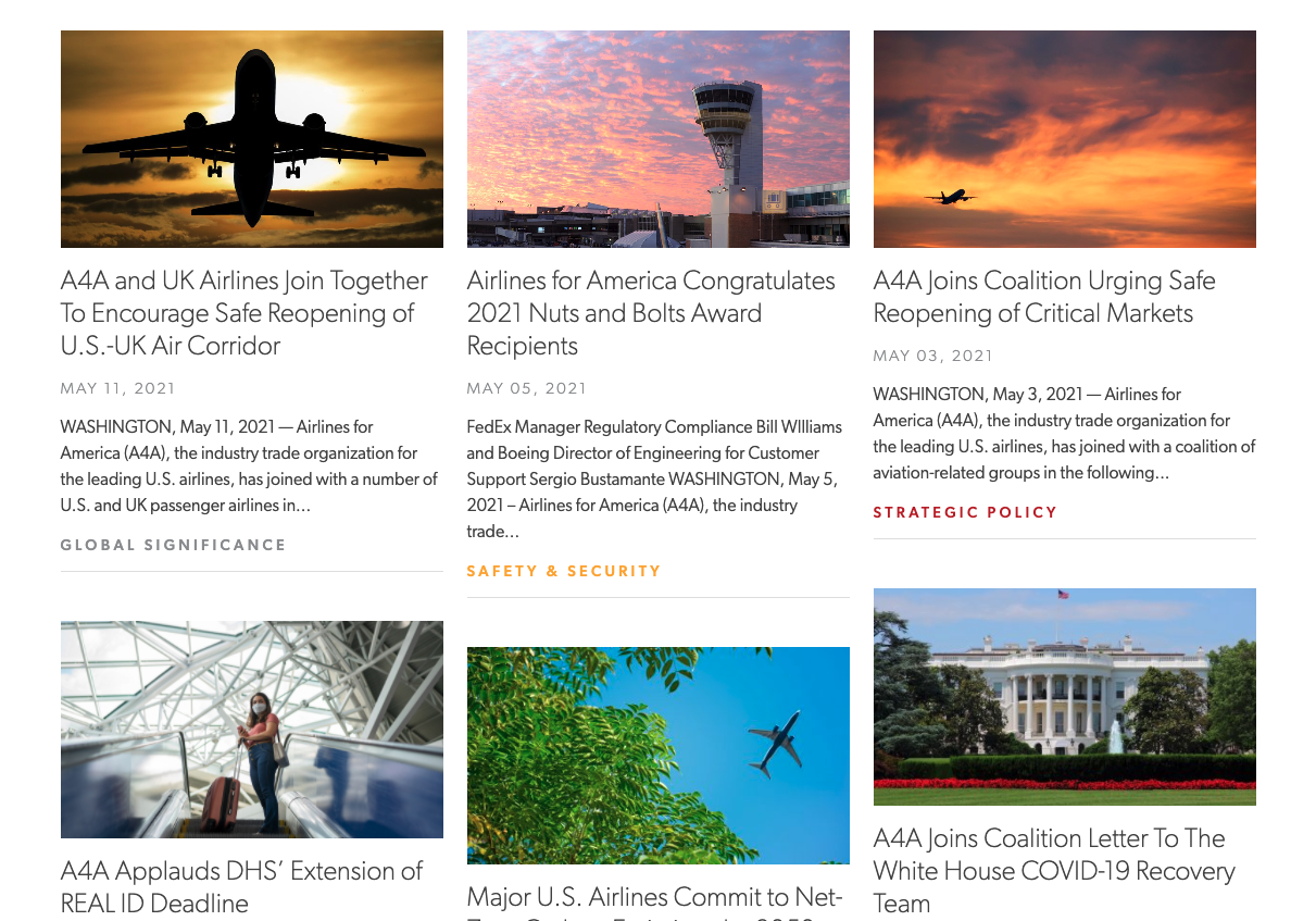
 The new blog post.
My Approach
Reuseable blocks with precision spacing
Flex Box
CSS Grid
Block, Element, Modifier Methodology